Olive, Walnut & Mineral Plaster Color Strategy
An architectural color and textile consulting service establishing balanced, light-responsive material schemes centered around natural walnut grains, chalky mineral plasters, and grounding botanical olive textiles.
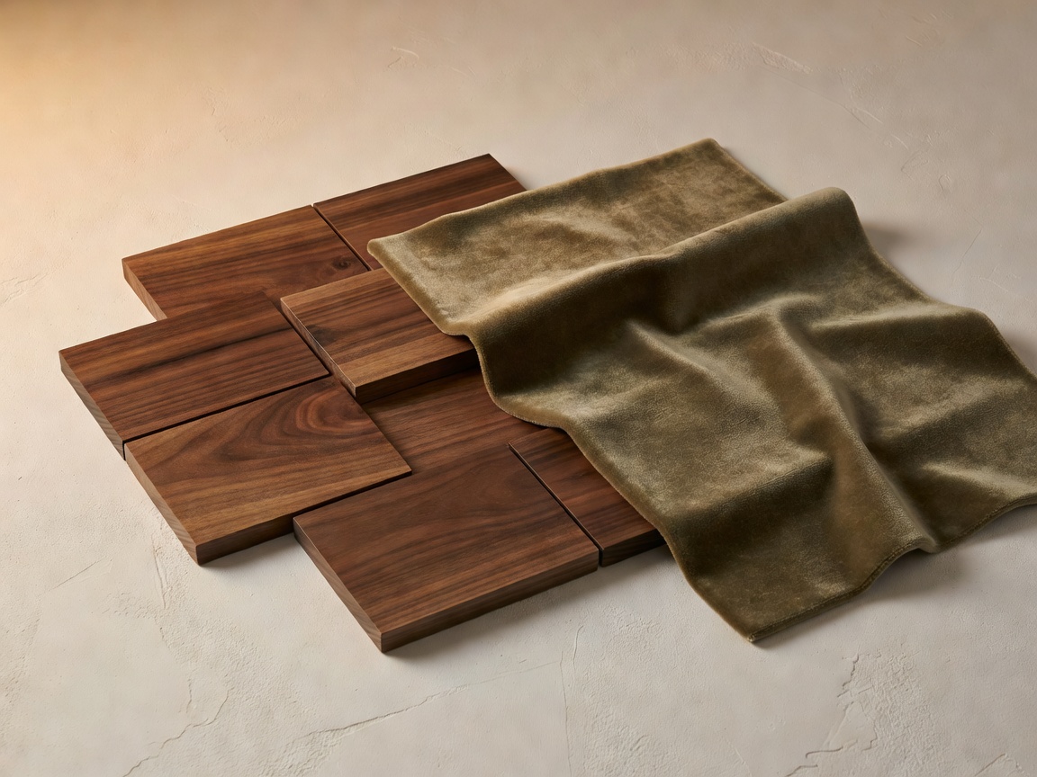
The Science of Tactile Harmony
Color in residential architecture cannot be viewed in isolation from texture and natural light. Our Color Strategy service takes the guesswork out of complex material palettes by conducting in-depth daylight studies and specifying exact paint, plaster, timber, stone, and upholstery finishes for every orientation in your home.
Consultation Inclusions & Deliverables
- Full-Home Material Master Schedule: Complete specification schedules detailing paint formulas, mineral lime wash plaster references, wood stains, and metal patina finishes.
- Bespoke Physical Sample Presentation Box: Curated physical samples including hand-troweled plaster swatches, oiled American walnut veneer blocks, honed limestone chips, and Belgian olive linen swatches.
- Natural & Artificial Light Analysis: Evaluating how north-facing versus south-facing light impacts green undertones and warmth values throughout morning and evening transitions.
- Textile & Upholstery Spec: Specifying durable, stain-resistant natural fibers including bouclé, Belgian linen, raw silk, and olive mohair velvets for key furniture pieces.
Harmonizing Architecture and Emotion
By rooting the palette in botanical olive and earthy timber tones, we create an interior canvas that feels inherently timeless, serene, and deeply connected to the natural world outside your windows.